link to other films
analyse the words of bokeh- analyse more carefully
annotate pictures and how they can relate to Bokeh
invisible sign
more discussions on the rough cut, what is being suggested?
Work on evaluations
Monday, 16 April 2012


review draft 1

"I like the image you've chosen to use as its very interesting and sums up the content of your film well, however, it doesn't show that you will change the light into a shape. To improve it you could put the text into collumns, like they do in real magazine reviews, and put an image of a shaped bokeh." - Hannah Emery, 17
"The font used looks quite boring. I know its more sophisticated than other film magazines, but I think it needs to look more fun. I wanna look at the page and be interest, not put off by office fonts. Maybe change the font to the same font used in the poster and film?" - Abi Jones, 17
From this feedback, Miranda decided to change the image to a still from the film- showing the audience what techniques have been used. We wanted to show the complexity of our film and the skill involved. Abi mentioned that the font looked too formal, considering our film is quirky, and so Miranda changed this to the font we have used in both our film and the poster. Giving all of the pieces the same house-style will make them more recognisable as a pair.
Film Review Drafts
Before finalising the information we were going to place onto our film review we wanted to create a few layouts and image selections until we had one we were happy with.


I took a few of our favourite images and imported them into a word document. After doing this i added other elements such as 'star ratings', captions and speech bubbles. Although these layouts are fun looking, i don't think they are suitable for our film. We need something a little more professional and neat looking.
Poster Designs

This is one of our favourite images that we took. Miranda uploaded this into photoshop and added the film title and production company name. I particularly like its simplicity but don't feel as though it is experimental enough for the film we have produced.

I had an idea of re-creating the words from our film using the word 'blur' instead. Miranda had a go at creating this to create something similar to the shots we had been producing. Its more experimental than the first and offers something interesting to look at.

 After seeing the poster for Martha Marcy May Marlene miranda was inspired to create something a long the lines of this. She used our favourite photo and transformed it into the word blur. We were both happy with this design yet felt as though we could be even more experimental.
Miranda then took the strongest images and applied them to the previous idea. We decided on a grey background because we felt as though it bought out the colours more- the white background became too overpowering. The text we chose is clear and easy to understand, yet doesn't draw attention from the image and title. The images we chose show our audience the concept and techniques used within our film, such as the stars and the person. It introduces the audience to the bokeh technique, and it intrigues them to find out more about our film.
Below are two of the posters i created myself.

As talked about previously, this idea was based on Un Chien Andalou and Welcome to the Rileys.

I wanted to take Miranda's poster further and add a coloured background a long with small information at the bottom.
Sunday, 15 April 2012
Poster Analysis

Andrea Arnolds Fish Tank
The dominating picture is of Mia- the protagonist of the film. Her surrounding looks grubby, this introduces Mia's lifestyle and one of the main settings of the film. The title itself is a bright blue capitalised font. Its situated in the middle immediately drawing in the audience. The blue and pink colour scheme matches part of the writing and scratches on the wall. We are introduced to the main characters, the director and are also given quotes from various newspapers, as well as star reviews. I think this poster fits its genre, however i don't think it would fit our type of film, we have no actors and no set locations. Our film mainly focuses on camera techniques and editing.

I came across the poster for Un Chien Andalou, an experimental film from Luis Buñuel. I really like the layout for this, its simple but offers the audience a glimpse of the film. Selecting the strongest or most significant shots of the film instead of using just the one may be more suitable for us, as we have been finding it difficult to select just the one image. After coming across this it reminded me of the Welcome To The Rileys poster, a more recent film with the same kind of layout.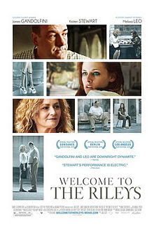

Not only do we see some of the most rememberable shots from the film we also receive quotes from those that have seen it. This allows us as the audience to make up our minds, a positive quote often sways us into wanting to see the film. The colouring introduces the main characters, those that progress the narrative are in colour where as the other shots are a saturated blue. The text informs us of the name of the film, the actors- whether they be well known or not, the distribution and production company, and the names of others with important roles.
Below is a poster i created using this layout, i selected a few of my favourite shots and played around with the layout until i had something i was happy with.

Saturday, 14 April 2012
Choosing the poster image
After looking at a number of the images from the film, we still couldn't decide on just the one. We showed some of the images to our friends to see what they thought.

"I love this one! I'm not sure what I love more about it, the texture and contrast of all the different colours inside the one shape or just the pure simplistic nature of it! I love how all the colours look so complete next to each other! Great job!!" - Ben Cockram, aged 18

Still, after no decision on what image to use, we decided to set out and find ways we could incorporate a few of the images we liked into one poster.
Subscribe to:
Posts (Atom)