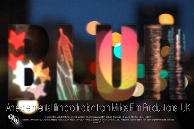
This is one of our favourite images that we took. Miranda uploaded this into photoshop and added the film title and production company name. I particularly like its simplicity but don't feel as though it is experimental enough for the film we have produced.
I had an idea of re-creating the words from our film using the word 'blur' instead. Miranda had a go at creating this to create something similar to the shots we had been producing. Its more experimental than the first and offers something interesting to look at.
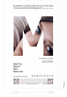
 After seeing the poster for Martha Marcy May Marlene miranda was inspired to create something a long the lines of this. She used our favourite photo and transformed it into the word blur. We were both happy with this design yet felt as though we could be even more experimental.
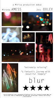
Miranda then took the strongest images and applied them to the previous idea. We decided on a grey background because we felt as though it bought out the colours more- the white background became too overpowering. The text we chose is clear and easy to understand, yet doesn't draw attention from the image and title. The images we chose show our audience the concept and techniques used within our film, such as the stars and the person. It introduces the audience to the bokeh technique, and it intrigues them to find out more about our film.
Below are two of the posters i created myself.

As talked about previously, this idea was based on Un Chien Andalou and Welcome to the Rileys.

I wanted to take Miranda's poster further and add a coloured background a long with small information at the bottom.


No comments:
Post a Comment