Andrea Arnolds Fish Tank
The dominating picture is of Mia- the protagonist of the film. Her surrounding looks grubby, this introduces Mia's lifestyle and one of the main settings of the film. The title itself is a bright blue capitalised font. Its situated in the middle immediately drawing in the audience. The blue and pink colour scheme matches part of the writing and scratches on the wall. We are introduced to the main characters, the director and are also given quotes from various newspapers, as well as star reviews. I think this poster fits its genre, however i don't think it would fit our type of film, we have no actors and no set locations. Our film mainly focuses on camera techniques and editing.
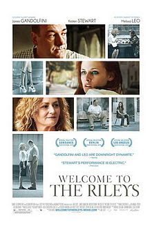
I came across the poster for Un Chien Andalou, an experimental film from Luis Buñuel. I really like the layout for this, its simple but offers the audience a glimpse of the film. Selecting the strongest or most significant shots of the film instead of using just the one may be more suitable for us, as we have been finding it difficult to select just the one image. After coming across this it reminded me of the Welcome To The Rileys poster, a more recent film with the same kind of layout.

Not only do we see some of the most rememberable shots from the film we also receive quotes from those that have seen it. This allows us as the audience to make up our minds, a positive quote often sways us into wanting to see the film. The colouring introduces the main characters, those that progress the narrative are in colour where as the other shots are a saturated blue. The text informs us of the name of the film, the actors- whether they be well known or not, the distribution and production company, and the names of others with important roles.
Below is a poster i created using this layout, i selected a few of my favourite shots and played around with the layout until i had something i was happy with.


No comments:
Post a Comment